I won’t waste your time. It’s here. It’s hot. It’s big. It’s loud. I’m in love with it.

There are so many things I could say about this cover. A lot of care went into the design, and it looks absolutely delicious.
My editor, T., wanted this to feel like “ a big book.” We needed something high-contrast and eye-catching that would demand a reader’s attention as soon as they walked into the bookstore. Because the title is still one of everybody’s favorite things about this book, and because the words are so short and so perfectly matched in size, I suggested we go big with the title itself.
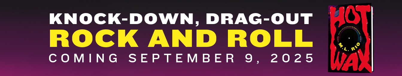
If you want to hear more about this process and what went into the design, I go in depth over on Substack, which is still the best place to keep up with all the goings-on going on behind the scenes. If you’re rather just pre-order the book, you can do that here (and I might just add that all pre-orders are 25% of at Barnes & Noble with the code PREORDER25). It’s hitting shelves on September 9. Hope you love it as much as we do.